
Talk:Fraktur
Note: dates for "Emperor Maximilian I (1493-1519)" do not match up with dates for Maximilian I: are there two of them?
- The dates in this article are the dates he ruled, so I've added an 'r.' to indicate that. -- Someone else 20:23 May 12, 2003 (UTC)
I really don't think "Blackletter" should redirect here... --Furrykef 07:35, 26 Jun 2004 (UTC)
| This It is of interest to the following WikiProjects: |
|||||||||||||||||||||
| |||||||||||||||||||||

"More Artificial"[edit]
"During that time, new, more artificial Fraktur typefaces were designed". How can a font be "more artificial"? Someone should rewrite this clearer.
I believe that the assertion of typeface commissions for script-hands is quite misleading here sense both Blackletter and Fractura are are formal chancery, They evolved as a natural progression from Gothic and Bastarde. Furthermore, to say that there is any Roman connection or even Caroline per se is gross to the point of insultingly racist and naive.
The Royal Academy has confirmed that the Uncial is of North African origin it evolved into the insular form and later the caroline which benevethian and corbal scripts modified leading to a Gothic quest for a more mechanical and uniform hand. Thus the textura and quadrata terminals and ligatures were modified to clear up the Dominius factor which is the intention of the Bastarde. Independently when writting either the Textura:"web"or Quadrata the letters minu, ominii in dominus becomes obscure.
As for the Roman contention, note in the examples of the Neudorffers A,D,E,F,H,K,M,N,P,Q,T,V, are not based on Roman letters but the Uncial, and likely some Vandels connection post the 3rd Punic War. I can imagine how this might have been a shock to Nazis, but the Fractura was still a common sight during the 2nd World War, and you need only look at roadsigns to confirm that fact. However I am not clear on when the cursive german call Der Kurrant went out of favour and this may be the open Nazi angst. —Preceding unsigned comment added by MicPowell (talk • contribs) 05:16, 1 October 2007 (UTC)
!941? 1945?[edit]
I'm confused by this:
The article says Fraktur was supported by Nazi policy until 1945, but it also says that it was denounced in 1941. Was it only supported by Nazi policy until 1941? -Theshibboleth 8 July 2005 15:45 (UTC)
Perhaps Antiqua-Fraktur_dispute, could help ... --217.231.212.137 23:00, 12 August 2007 (UTC)
The official end of Fraktur in Germany was 1941, but change didn’t happen immediately: typesetting required real letters and wasn’t done on computer. People had other sorrows. – Fritz Jörn (talk) 04:13, 17 January 2014 (UTC)
Christmas Cards?[edit]
Is this font (typeface) used sometimes in Christmas Cards? What is a better type face to use that looks 'Old-tyme' Christmassy without the racist conections? --RPlunk 17:24, 13 December 2005 (UTC)
- I have no idea. Just to remind you: It were the nazis who abolished this script accusing it of being Jewish. ― j. 'mach' wust | ✑ 07:25, 14 December 2005 (UTC)
Mein Kampf[edit]
Among a number of old German books I have in Fraktur is a copy of Mein Kampf printed in 1935 and identified on the title page as the 151st edition. It seems ironic that the Nazis would actually have banned the font used by their idol in his supposedly seminal — if revolting and essentially unreadable — work. Just an observation. (Let me assure you, this tome interests me only as a historical artifact.) Sca 03:41, 24 October 2006 (UTC)
What are you so nervous about? Do you live in a country that has thought police or something? — Preceding unsigned comment added by 72.196.41.67 (talk) 13:59, 27 June 2018 (UTC)
SVG version of [File:Gebrochene_Schriften.png][edit]
The SVG version of that image misses the fraktur column, which would be important for this article. Srrrgei (talk) —Preceding undated comment added 01:25, 3 February 2010 (UTC).
German map from 1901[edit]
I would advise against not taking the map from Justus Perthes too literally. By 1900 Denmark (and I would guess Norway as well) had mostly changed to Latin script usage. The change occurred during the latter half of the 19th century, and I would estimate that by the 1860s Latin script had overtaken Fraktur as the most common script in Denmark (the teaching of Gothic handwriting in schools stopped in 1875). --Saddhiyama (talk) 08:55, 16 May 2010 (UTC)
- So you do want us to take the map literally? — Preceding unsigned comment added by 72.196.41.67 (talk) 14:00, 27 June 2018 (UTC)
- I have found a Danish languaged source where historian R. Paulli has calculated the percentages of the total amount of materials printed in antiqua in Denmark in the years 1843, 1883 and 1902. They are 5%, 63% and 95% respectively. (R. Paulli, "Den sejrende antikva", i: Det trykte Ord, published by Grafisk Cirkel, Copenhagen, 1940.) So the map presentation that Denmark was mostly using fraktur around 1900 is not accurate, it had already tipped prior to 1883, so I have taken the liberty of removing the image from the article. --Saddhiyama (talk) 10:54, 29 January 2011 (UTC)
- It's the best map we have. We can point out errors, or better yet edit the map (and upload as a new file) or create a new one on a blank map of Europe, but I hate to see it completely removed from the article.--Prosfilaes (talk) 03:53, 31 January 2011 (UTC)
- I can't see how "it's the best map we have" can be Wikipedia policy when the map is obviously containing misinformation. Judging from the term "Deutschen Alphabet" used for fraktur in the legend, it suggests that the map makers might have had more than just a scientific agenda.
- Furthermore according to Tore Rem, "Materielle variasjoner. Overgang fra fraktur til antikva i Norge." in: Mats Malm, Barbro Ståhle Sjönell & Petra Söderlund (eds.), Bokens materialitet - Bokhistoria och bibliografi, Svenska Vitterhetssamfundet, Stockholm, 2009, fraktur was also disappearing from Norwegian books around 1900 and was not the most used script in Norway at that time either.
- So the most correct representation would be for Denmark and Norway to have the third option in the legend "Beschränkter Gebrauch von Fraktur neben herrschender Antiqua", like Sweden has. Perhaps someone experienced with Photoshop could change it accordingly, but frankly, these two obvious mistakes make me doubt the veracity of the rest of the map as well. --Saddhiyama (talk) 08:51, 31 January 2011 (UTC)
- I have changed the image text of the map to reflect the correct information. Although I would still prefer that this map, which is obviously incorrect, should be removed altogether. --Saddhiyama (talk) 22:59, 16 April 2011 (UTC)
- Actually, it's not true that only Germany used Fraktur; most German publication in any country was in Fraktur. And I don't see that you've made a better map to replace it.--Prosfilaes (talk) 16:08, 17 April 2011 (UTC)
- You have obviously not read what I wrote properly. I have not claimed that only Germany used fraktur. I have claimed, and provided sources to back it up, that some of the countries shown on the map as having a majority of fraktur-publications, in fact had a majority of antiqua-publications around 1900. And no, I have not made a new map because I do not have the skills nor software to do so. I also find your insistence about not removing what is clearly an incorrect map until a new one is produced very odd, and frankly contrary to Wikipedia policy. --Saddhiyama (talk) 16:20, 17 April 2011 (UTC)
- You wrote "In reality only Germany, Estonia and Latvia still used fraktur as the majority script at this time." That's wrong.--Prosfilaes (talk) 17:42, 17 April 2011 (UTC)
- As you've already corrected it, "Germany" should have been replaced by "German-speaking countries" (Germany, the German-speaking parts of Austria-Hungary and Switzerland). Regarding the situation in Estonia and Latvia, I know little, but it seems logical that they followed German practice given the prominent position of the Baltic Germans at the time. However, it remains a fact that the map misrepresents the situation in Denmark and Norway at the indicated year. In Denmark, Fraktur writing ("gotiske bogstaver") lost ground due to the 1848-1851 and 1864 wars, as the alphabet was perceived as German, and Norway was also shifting away from the old writing system. As Saddhiyama has noted, Danish schools were instructed to cease instruction in the Fraktur handwriting in 1875, so that handwriting would be instructed only in the Latin script. 89.150.160.26 (talk) 18:35, 29 October 2011 (UTC)
- You wrote "In reality only Germany, Estonia and Latvia still used fraktur as the majority script at this time." That's wrong.--Prosfilaes (talk) 17:42, 17 April 2011 (UTC)
- You have obviously not read what I wrote properly. I have not claimed that only Germany used fraktur. I have claimed, and provided sources to back it up, that some of the countries shown on the map as having a majority of fraktur-publications, in fact had a majority of antiqua-publications around 1900. And no, I have not made a new map because I do not have the skills nor software to do so. I also find your insistence about not removing what is clearly an incorrect map until a new one is produced very odd, and frankly contrary to Wikipedia policy. --Saddhiyama (talk) 16:20, 17 April 2011 (UTC)
- Actually, it's not true that only Germany used Fraktur; most German publication in any country was in Fraktur. And I don't see that you've made a better map to replace it.--Prosfilaes (talk) 16:08, 17 April 2011 (UTC)
- I have changed the image text of the map to reflect the correct information. Although I would still prefer that this map, which is obviously incorrect, should be removed altogether. --Saddhiyama (talk) 22:59, 16 April 2011 (UTC)
- It's the best map we have. We can point out errors, or better yet edit the map (and upload as a new file) or create a new one on a blank map of Europe, but I hate to see it completely removed from the article.--Prosfilaes (talk) 03:53, 31 January 2011 (UTC)
"Fraktur" vs "fraktur"[edit]
This article varies between using "Fraktur" vs "fraktur". I'm no expert on [Ff]raktur (neither historically nor just graphically), so I have no idea whether it's a good/bad idea to change every instance of "[space]fractur" to "[space]Fraktur". Maybe someone knowledgeable can tackle this. sburke@cpan.org (talk) 08:21, 23 July 2012 (UTC)
- I consulted an Oxford dictionary (Oxford American Dictionary) and found only the upper-case listed. It seems best to stick with upper-case Fraktur by analogy with Schwabacher, Textura, Antiqua, etc. — ℜob C. alias ÀLAROB 18:08, 6 October 2013 (UTC)
- Fixed, except for an instance of "fraktur" in the title of a Norwegian reference. — ℜob C. alias ÀLAROB 18:16, 6 October 2013 (UTC)
External links modified[edit]
Hello fellow Wikipedians,
I have just added archive links to one external link on Fraktur. Please take a moment to review my edit. If necessary, add {{cbignore}} after the link to keep me from modifying it. Alternatively, you can add {{nobots|deny=InternetArchiveBot}} to keep me off the page altogether. I made the following changes:
- Added archive https://web.archive.org/20151016231306/http://www.cooper.edu/art/lubalin/bletterpub.html to http://www.cooper.edu/art/lubalin/bletterpub.html
When you have finished reviewing my changes, please set the checked parameter below to true to let others know.
This message was posted before February 2018. After February 2018, "External links modified" talk page sections are no longer generated or monitored by InternetArchiveBot. No special action is required regarding these talk page notices, other than regular verification using the archive tool instructions below. Editors have permission to delete these "External links modified" talk page sections if they want to de-clutter talk pages, but see the RfC before doing mass systematic removals. This message is updated dynamically through the template {{source check}} (last update: 18 January 2022).
- If you have discovered URLs which were erroneously considered dead by the bot, you can report them with this tool.
- If you found an error with any archives or the URLs themselves, you can fix them with this tool.
Cheers.—cyberbot IITalk to my owner:Online 01:33, 22 February 2016 (UTC)
Are the typface samples really the fraktur?[edit]
I am not sure, but the typeface samples listed in the article such as  seem to be rotunda and not fraktur. See also the the comparison table. --Jan Kameníček (talk) 06:20, 11 May 2016 (UTC)
- Yes, they are, even though the capital letters are not very typical. The distinctive features of fraktur are nicely illustrated in the comparison table you have linked. The main differences are in the small letters. A small letter o in textura has angles on both sides; angles only on the left side in fraktur – which is exactly what you find in the file
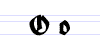 –; no angles on either side in schwabacher, but still on the top and at the bottom; and no angles at all in rotunda.
 - The one sample that arguably is not fraktur is File:Schriftzug_Fraktur.svg. Fraktur is a typeface, but this sample does not show any typeface, but it is handwritten. --mach 🙈🙉🙊 17:36, 11 May 2016 (UTC)
- I see. However, if these are not very typical, as you say, I believe they should be replaced by some more typical in the article. Jan Kameníček (talk) 22:29, 11 May 2016 (UTC)
- The samples look like they're in UnifrakturCook, which, I think, is based on fraktur lettering but not 100%. The Old Macintosh (talk) 15:22, 15 June 2023 (UTC)

External links modified[edit]
Hello fellow Wikipedians,
I have just modified one external link on Fraktur. Please take a moment to review my edit. If you have any questions, or need the bot to ignore the links, or the page altogether, please visit this simple FaQ for additional information. I made the following changes:
- Added archive https://web.archive.org/web/20160203234441/http://moorstation.org/typoasis/designers/steffmann/index.htm to http://moorstation.org/typoasis/designers/steffmann/index.htm
When you have finished reviewing my changes, you may follow the instructions on the template below to fix any issues with the URLs.
This message was posted before February 2018. After February 2018, "External links modified" talk page sections are no longer generated or monitored by InternetArchiveBot. No special action is required regarding these talk page notices, other than regular verification using the archive tool instructions below. Editors have permission to delete these "External links modified" talk page sections if they want to de-clutter talk pages, but see the RfC before doing mass systematic removals. This message is updated dynamically through the template {{source check}} (last update: 18 January 2022).
- If you have discovered URLs which were erroneously considered dead by the bot, you can report them with this tool.
- If you found an error with any archives or the URLs themselves, you can fix them with this tool.
Cheers.—InternetArchiveBot (Report bug) 04:45, 5 October 2017 (UTC)
Can't parse this sentence[edit]
I can't parse this sentence in the lead: "From this, Fraktur is sometimes contrasted with the "Latin alphabet" in northern European texts, which is sometimes called the "German alphabet", simply being a typeface of the Latin alphabet." Huh? Could someone who understands this please break it up into multiple clearly written sentences? Kaldari (talk) 17:31, 7 November 2019 (UTC)
Unicode characters ℭ U+212D, ℌ U+210C, ℑ U+2111, ℜ U+211C, ℨ, U+2128 are not Fraktur[edit]
In Unicode, the characters ℭ U+212D, ℌ U+210C, ℑ U+2111, ℜ U+211C, and ℨ U+2128 are separate from the mathematical Fraktur characters. The Fraktur letters (excluding the bold versions) are: 𝔄𝔅𝔇𝔈𝔉𝔊𝔍𝔎𝔏𝔐𝔑𝔒𝔓𝔔𝔖𝔗𝔘𝔙𝔚𝔛𝔜𝔞𝔟𝔠𝔡𝔢𝔣𝔤𝔥𝔦𝔧𝔨𝔩𝔪𝔫𝔬𝔭𝔮𝔯𝔰𝔱𝔲𝔳𝔴𝔵𝔶𝔷.
The code points for the capital C, H, I, R, and Z are reserved. In the article's bottom section, though, these places are replaced by ℭ, ℌ, ℑ, ℜ, and ℨ but these characters are different. They're under the label "BLACK-LETTER" and are part of the Letterlike Symbols block, while the Fraktur ones are from Mathematical Alphanumeric Symbols. The Old Macintosh (talk) 15:46, 15 June 2023 (UTC)
- In the Unicode model, Fraktur is just another typeface. Should you want to set some text in Fraktur, you would just use
<span style="font-family: Fraktur">Abcdefg</span>. The mathematical set were provided because of a particular mathematical need. --𝕁𝕄𝔽 (talk) 16:24, 15 June 2023 (UTC)- "Just" in scare quotes because few readers will have a compatible font installed. So if, as in this article, you want to communicate about Fraktur, the mathematical and blackletter set provides a limited means to do so. (And even then, their system may not even have a generic fallback font like Noto.) The same issue arises with Gaelic type (q.v.). 𝕁𝕄𝔽 (talk) 16:40, 15 June 2023 (UTC)
Weird note[edit]
I removed this note in the text:
<!--the umlauted vowels wouldn't be encoded even if Fraktur were accepted as an additional script-->
Why?-- Carnby (talk) 07:09, 29 July 2023 (UTC)
- I couldn't make sense of it either. I started to convert it to a footnote but decided best leave it for someone else. I don't know any German (beyond eine grosse Bier, bitte) but I speculated that Fraktur didn't use the two dots umlaut but rather its predecessor, a little 'e'. Wild guess! --𝕁𝕄𝔽 (talk) 09:30, 29 July 2023 (UTC)
Found some in the wild[edit]
A 1906 German newspaper in St. Louis, Missouri, was apparently typeset entirely in Fraktur. Check this out: "die letzte salve". Westliche Post. St. Louis, Missouri. 1906-07-21. p. 7. Retrieved 2023-11-01 – via Newspapers.com.</ref> jp×g🗯️ 19:41, 1 November 2023 (UTC)

Desirable example?[edit]
It seems to me that the best examples for comparison would be calligraphic hand-written Fraktur and calligraphic hand-written Italic. This would show the contrast between the styles much more clearly than typeset examples. Certainly there are handmade examples of both types by Hermann Zapf, but those are under copyright as far as I know. TooManyFingers (talk) 18:23, 27 March 2024 (UTC)
- To the best of my understanding, fraktur is first and foremost a typeface class. Using a handwritten sample would be inadequate, just as inadequate as using a handwritten sample for the antiqua. Sure, both typeface classes were originally derived from handwritten forms, but for half a millenium, their development and refinement has happened in the medium of typefaces. --mach 🙈🙉🙊 22:15, 27 March 2024 (UTC)
- Start-Class vital articles
- Wikipedia level-5 vital articles
- Wikipedia vital articles in Society and social sciences
- Start-Class level-5 vital articles
- Wikipedia level-5 vital articles in Society and social sciences
- Start-Class vital articles in Society and social sciences
- Start-Class Writing system articles
- High-importance Writing system articles
- Start-Class Germany articles
- Mid-importance Germany articles
- WikiProject Germany articles