Wikipedia:Featured picture candidates/Image:LindisfarneFol27rIncipitMatt.jpg
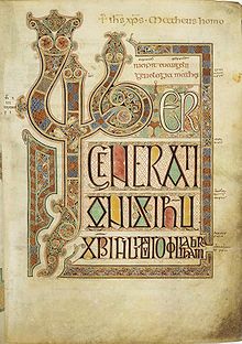
Folio 27r of the Lindisfarne Gospels[edit]
 | |
 |
This is a very good image of one the major pages from one of the great illuminated manuscripts, the Lindisfarne Gospels. I downloaded the image from the British Library online catalog (here). It is used in Lindisfarne Gospels, Book of Kells, and Cotton library. - Dsmdgold 22:00, May 24, 2005 (UTC)
- Nominate and support. - Dsmdgold 22:00, May 24, 2005 (UTC)
Oppose. Poor contrast/brightness, none to interesting subject IMO --Fir0002 07:33, May 26, 2005 (UTC)
- I think you may have been misled by the nature of the subject. The book is vegetable pigment painted on aninal skin and is 1300 years old. The uncropped version has color scales for comparison. I think the contrast/brightnessis very good. As for interest, taste varies, but I have known people who traveled thousands of miles and crossed oceans specifically to look at this book. Dsmdgold 12:43, May 26, 2005 (UTC)
- Really? Wow, that's pretty interesting, and that certainly explains the coloration of the document, but no, I'm sorry but the image doesn't interest me too much. But that's just me so I'll change my vote to Neutral --Fir0002 04:13, May 27, 2005 (UTC)
- I had a play with the contrast, saturation and cropped it a little more. Is this better? I didn't want to ruin the age or alter the colours. If you zoom in it does have very good detail. --Silversmith Hewwo 14:57, 27 May 2005 (UTC)
- Weak support #3 - We ought to be able to find a medeival manuscript we can support and the Lindisfarne Gospels are a good choice. The version with reference swatches is useful here as it shows that the original is too dark. I've tried another adjusted version (#3), concentrating on getting the balance in the swatches as even as I can. I imagine the vertical 20 step grey scale on the right should be evenly distributed, implying a decrease of ~12 between each step (RGB = 255/255/255 - 242/242/242 ...) This adjusted version is still a little biased towards the dark end as I didn't want to push any corrections too far. We would still need to crop to just show the page to conform to a {PD-Art} tag. -- Solipsist 10:24, 30 May 2005 (UTC)
- Of the adjusted versions I prefer #3. The vellum is too yellow on #2. The cropping on #2 is also too radical. Some text has been lost to the left of the large letter "L", and too much "white space" has been cropped from the bottom. How the image lies on the page is important. I would prefer cropping as close to the edge of the folio as possible. I agree with Solipsist that the image must be cropped for legal reasons. (Cropping is also needed for aesthetic reasons.) Dsmdgold 16:42, May 30, 2005 (UTC)
- Support --Bernard Helmstetter 18:56, 31 May 2005 (UTC)
- My support goes to #3, by the way. --Bernard Helmstetter 16:02, 1 Jun 2005 (UTC)
- Support #3 — Oska 05:12, Jun 5, 2005 (UTC)
- Support number 3, though I would prefer it cropped. James F. (talk) 19:53, 5 Jun 2005 (UTC)
Promoted Image:LindisfarneFol27rIncipitMatt.jpg +5 / 0 / 1 neutral - Promoted version #3 after cropping and overloading onto the original version. -- Solipsist 20:06, 12 Jun 2005 (UTC)
